


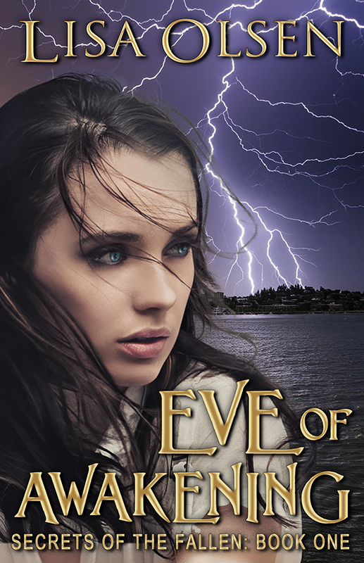
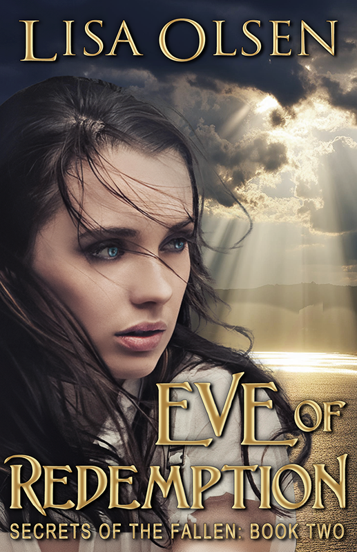
Vote for Cover Art – Moonsong


It’s that time again to give me your thoughts and feedback on the cover art for my new book, Moonsong. Anyone who comments on the covers on the website will be automatically entered for a chance to win a copy of one of my books (your choice of books).
I know the difference is subtle, and please remember this will be mostly seen against a white background on Amazon.com, since that is where I sell the most. I’d also love to hear constructive criticism and ideas for how to improve them if you have any suggestions. Please keep in mind that they have to be not only eye-catching, but easy to identify when much smaller in ads and for sale on websites.
Here is a little blurb of what the book is about:
After werewolves attack her family, Amelia Singer escapes to Cutter’s Folly in search of her long lost Grandmother. There she finds the strangest revelation yet; not only is she descended from a long line of shapeshifters; Amelia’s firstborn is destined to lead the pack to dominion over all others. Now power hungry shifters everywhere will stop at nothing to share in that prophecy. Choosing a mate is the only way to end the violence, but how can she be expected to choose a man she’s known for less than a week? At the heart of this struggle, Amelia is torn between Chase, who makes her pulse race with a single sultry glance, and Cutter, a reclusive but tempting loner with secrets of his own. Can fiercely independent Amelia find happiness with the pack, or will she rebel under the pressure and take her chances on her own?

I like the one on the left. The one on the right is kind of greenish and reminded me of tornado weather. lol
Beautiful cover, btw!
I like the second one best with the subtle hint of green in it, makes it a little more spooky I think. I can’t wait to read it!
I have to say I like the one on the right…it’s different, which is why I think it would stand out better than the blue one, which will tend to blend in more. Love them both, though!!
normally i prefer green…but I prefer the right one here.
I think the one on the left is better, the darker one. It looks more like night to me. The one on the right looks more like you’re on another planet. It just looks weird. Not a fan of the aqua coloured one at all.
This is a tough one. The blue one looks gloomy while the green one looks creepy. I personally like blue but I have a feeling green stands out more?
The blue looks more like nighttime. The green stands out good, but it makes it look more like daytime.
Ok…I went back and forth on this one. They both look good. But after enlarging them and looking closer, I think I would choose the second one. Like others have said, it’s a little more eerie but I noticed you can also see the color a little more thru the trees.
Yes, there isn’t much difference, but my eyes were drawn to the one on the left.
I like the one on the left, the bluer one. The name and title pop more. The moon is more striking but wouldn’t detract and it feels more “real” if that makes sense?
Great cover!
My eyes went straight for the greenish color. The blue is pretty, but the green stands out more in my opinion. It sort of gives that creepy and bad omen kind of feeling. lol
the greenish one is really nice, but I like the blue one better. )
)
Well, I hate to add to the confusion but I have to say that (to me) the bluer one is my preference. It just ‘pops’ out at you.
Good luck choosing
I vote for the one on the left, the one more like a night sky. I agree the one on the right looks gloomier (good for a “Jane Eyre” atmosphere) The small story blurb doesn’t convey that much of a gothic vibe. I think it will show up fine, but make the fone bolder if it doesn’t. I don’t think the subtle sky color will make a difference either way.