


Vote for cover of Hear Me When the Sun Goes Down
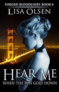

Happy Saturday m’lovelies! I’ve just finished the first draft of Hear Me When the Sun Goes Down, which means I get a few hours to catch up on TVD episodes and Hallmark movies and then it’s on to the editing process. The Captain’s been hard at work on the new cover and we’ve got a couple of options we’d love to get your opinion on. This cover is a bit of a departure from the other Forged Bloodlines books, but I fell in love with this pic of “Anja” and couldn’t resist trying to make it work. As incentive, I will be giving away a copy of Hear Me (or one of my other books if you prefer) the winner have a choice of an ebook or a signed print book once they’re out. To enter, just vote which cover you prefer in the comments below.

I prefer the black and white. The gold stands out to much and takes away from anja.
I agree, the black and white. Sticks to the looks of the other book covers, which I adore, and the gold takes away from Anja. Love the cover! Its beautiful! Cannot wait to read it! <3 <3 <3
black and white
The one on the right
Black and white!:)
And here I go, always being the odd man out… I really love the contrast of the one on the left. Makes the city stand out.
Excellent job on these covers, AJ! They look amazing!
I also like the one on the right.
I’m the odd one out…I rather like the gold bridge one…except for the tiny point of red light thats practically hanging off the end of her nose Even on the black and white one, that little point of light seems like it should be eliminated.
Uhh good one, I didn’t notice that, but you are right the red should go away
On the right
I like the gold one
The one to the left (with the color on)
Definitely the black and white! I shudder to think of what Rob would say about a bridge trying to overshadow anja lol
I think the black and white is way more poetic. Thats definitely my favorite! btw, when is the book comming out?? I can´t waaaait to read it.. im missing Anja!
I like the gold cover, it’s vibrant and warm like I perceive Anjal to be. I think the other is not quite right
I like the one on the right the best, it goes along with the others really well.
I prefer the one on the left with the color added. Love it!
I like the golden bridge on the left myself
I like the one with color on the left, it captures her vibrancy more then the B&W. (But do agree to take away the red light near the tip of her nose.)