


Vote on Cover Art for Find Me When the Sun Goes Down


Vote on Cover Art for Find Me When the Sun Goes Down
(and enter to win a free copy of one of my books!)
Okay guys, it’s time to give me your thoughts and feedback over the cover art for Find Me When the Sun Goes Down. Anyone who comments on the covers on the website will be automatically entered for a chance to win a copy of one of my books (your choice of any via ebook). I won’t say which one of these is my favorite, but take a look at the blurb below and let us know which cover you prefer. We’d also love to hear constructive criticism and ideas for how to improve them if you have any suggestions.
“You know we never really talked about what it means that you’ve claimed me.”
Newbie vamp Anja Evans is eager to find out what it means to be claimed by sexy, vampire cop, Bishop. Unfortunately, he’s been transferred by the Order and she’s left to fend for herself. Eager to make up for his betrayal, bodyguard Rob offers a surprise trip to England, but will Anja find her happy ever after taking her place in vampire society? Or will the cutthroat political climate reveal what drove Bishop out of Europe in the first place? To complicate matters, there’s a vampire hunter on the loose wreaking havoc on the streets of London. Is Bishop being overprotective, as usual, or is Anja in real peril of losing her head? Mortal danger aside, the real threat to Bishop and Anja may just come from within.
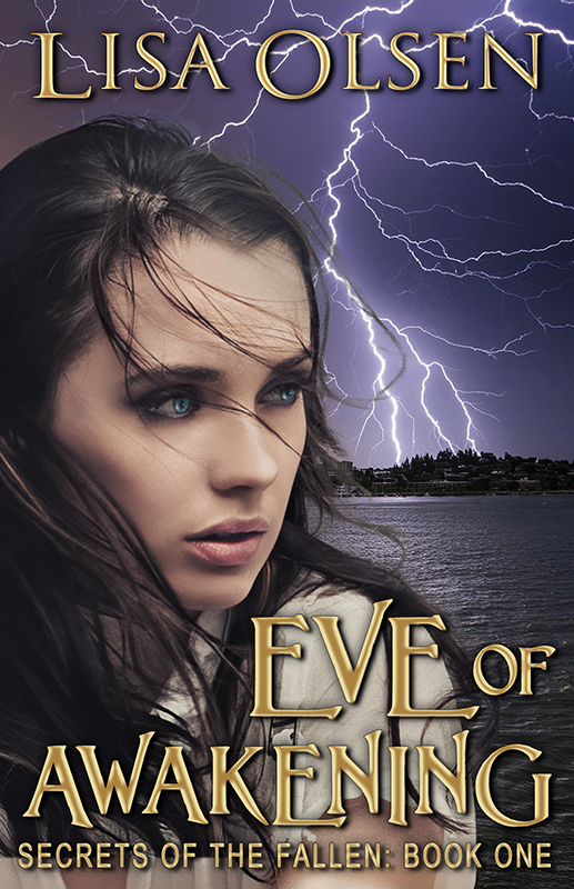
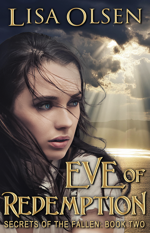

I like the cover on the right best…as it shows the sun going down (like in the title).
I vote for the one on the left. The yellow coloration in the one on the right is visually interesting, but it detracts from your lettering.
Right one. Look more like sunset
Left one – I think it goes with the first two covers better.
Have to say I like them both. The left one is more cold, chilling looking but the right one is the one that caught my eye initially. I think the orange glow reminds me of the search/chase scene at the end of ET and it feels more threatening – so now I’ve sat well and truly on the fence – do I get a cookie? Lol x
The one on the left continues the visual theme you’ve already established for the series. The one on the right immediately makes me think “What’s going to be different about this one?” Personally, I prefer the simple, clean visual style of the left one; there’s just a bit too much going on for me in the other.
I like the one on the right better, I think…more visually appealing, and richer looking.
I like the one on the right more. The brownish-yellow colors caught my eye and made me want to take another look.
I like the one on the right…though I agree it washes out the text a little.
I prefer the one on the left. The colors are in the same trend with the rest of the series.
I love the left hand cover, keeps up with the ongoing theme.
The title of the book is marginally easier to read on the left so I prefer that one.
I like the one on the left. It flows well with the colors of the previous books.
#1 is keeping with the existing theme
I think they’re both great, but the one on the right caught my attention immediately. I can’t wait to see which one wins out.