


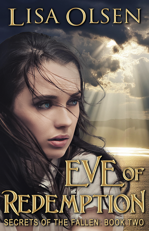
Vote on cover art for Miss Me When the Sun Goes Down


Hey guys. James, in a stroke of geniosity, has proposed an alternate cover for Miss Me When the Sun Goes Down. Since we haven’t had a giveaway in a while, I thought we’d put it to a vote. Simply weigh in with your opinion in the comments section and it automatically enters you in a drawing for a free copy of the new book. I’ll leave it up to you whether you’d prefer to have the ebook copy (which will be ready a lot faster) or a signed print copy (which will be a lot prettier).
So, let’s hear it – which cover do you prefer? The one on the left or the one on the right?
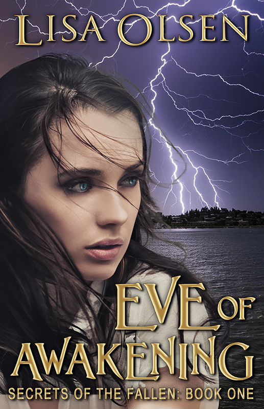

I say the one on the left. It matches the other covers better.
Also I think a person takes away from the title of “Miss Me” a little ^^;
The one on the right! Love it!
I think they’re both great, but I have to go with the one on the left. I think the loneliness of it just looks better.
Mike and I think the one on the right is the best.
The cover on the left is in keeping with the theme of all the other books, so that gets my vote. However, the right hand cover would be beautiful if it was a stand alone book. Looking forward to its release.
i agree that the cover on the left is keeping with the theme. they are both great…can’t wait for release.
I think the one on the right is more powerful.
I like the one on the right with the girl in the picture. To me, it conveys loneliness and aunting.
The one on the right…
Both gorgeous. The cover on the left is more haunting. I am going with the left.
I say go with the one on the left it matches the other books but I like them both. I can’t wait to read it!!
I believe the cover to the left appeals more.
the one on the left it matches the other covers and best suits the tittle
I like the one on the left better.
The cover on the left is more elegant, but it feels too empty for a book cover. On the one on the right, I don’t quite like the way the silhouette is drawn. However, my vote goes to the one on the right.
The one on the right
The one on the left:)
I like the cover on the right with the lonely female figure. That scene draws me in.