


Vote on cover art for Release Me When the Sun Goes Down
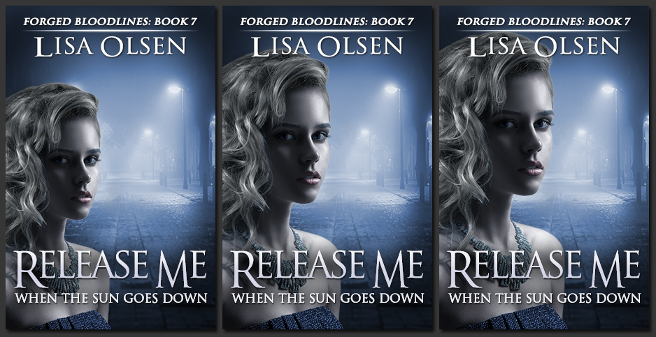
Happy Wednesday, m’lovelies! I’m deep into the first draft of Release Me When the Sun Goes Down, and normally wouldn’t mess with the cover yet, but we’re doing things a little differently this time. The Captain’s been hard at work on the new cover and my streetbots have helped us narrow it down to one design combination, but we’ve got a couple of options we’d love to get your opinion on. As incentive, I will be giving away an ebook copy of Release Me (or one of my other books if you prefer) once it’s out. To enter, just vote which cover you prefer in the comments below. Click the image to enlarge.

I like the first on the left. It’s is more eerie/suspenseful the the other two.
I like the one in the center.
I like the middle one! Its a good balance between the background and model!
I like the first cover.
I like the middle one.
I like the 3rd one, the one to the far right — just think it stands out more and is more appealing.
I Like the middle cover… not too small and not too big…just right
The middle one
Love the middle cover
1
The middle one!
First one!
I prefer the one on the far left. It looks cleaner.
I would say first one, it would go with your other covers since most of them are from a distance
The middle one.
Far left
Definitely the first one. The more prominent she gets (on the other 2), the less she seems to need to be “released.” She is more dominated by the rest of the space in the first cover – just seems to fit the title more.
I love the third one (right side).
Definitely the first! It has an air of suspense and mystery. I know we’re not supposed to judge a book by it’s cover, but people do. The first screams, “READ ME, I’M SO GOOD I’LL MAKE YOU HATE LIFE WHEN YOU’RE DONE AND WAITING FOR THE NEXT COUPLE MONTHS TIL THE NEXT ONE COMES OUT”
but maybe that’s just my feelings every time I’m done reading your books lol
Well, I have to admit that I must be very unobservant because it took me ages to actually see any differences at all!
However, having cleaned my specs and looked properly – I have to say that I like the last picture, where the model is ‘under/behind’ the text: it looks like she’s been caged by the words.
Having said that, as I read them on a kindle, I very rarely look at covers and dive straight into the book! ROFLMAO
I like the middle one the best