


Vote For Cover Art – Wake Me When the Sun Goes Down


It’s that time again to give me your thoughts and feedback on the cover art for my new book coming out this month, Wake Me When the Sun Goes Down. Anyone who comments on the covers on the website will be automatically entered for a chance to win a copy of one of my books (your choice of books). This time I was able to narrow it to a picture I liked, but I’m still trying to decide on the font. I’d also love to hear constructive criticism and ideas for how to improve them if you have any suggestions. Please keep in mind that they have to be not only eye-catching, but easy to identify when much smaller in ads and for sale on websites.
Here is a little blurb of what the book is about:
“It was ironic that this happened to me; I was never a night person at heart. So you can see right off the bat why a vampire was the very last thing I would have chosen to be.”
Anja Evans wakes up in the morgue with a helluva hangover. She chalks it up to a strange brush with death and gets back to her life as a music student in San Francisco. It takes almost eating her best friend before she figures out… she’s a vampire. When a dark and dangerous vampire shows up at her door asking to see her license and registration, Anja assumes Bishop is a regular cop. But breeding among vampires is strictly controlled, and her unlicensed status makes her an enemy of The Order. Struggling to find a balance between her former life and her undead one, Anja tries to blend school and living up to her new identity, all while searching to find the elusive Viking whose blood gave Anja the strength of a vampire hundreds of years old.

Ooh, I have been wanting your Pretty Witches book for some time now. Well, at first glance I like the second one better, but given the subject and tone, maybe the first one would fit better? Well either way, good luck! Your books look so great.
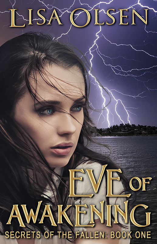
I like the one on the left. The little points scream “vampire”.
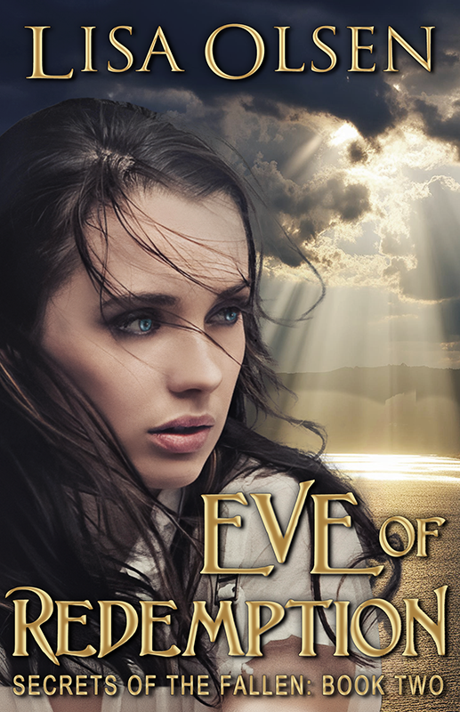
the one on the right, the cleaner font goes much better with the high contrast and simplicity of the graphic. the fancier font is lovely, but reads a bit witchy/fairy?
I like the one on the left. It’s like Rodney C. said, it just seems to say, Vampire.
I find the font on the first cover more appropriate for the subject. What I’m not so keen on is the way the sun looks with all those rays around, but that’s just me.
I like the clean lines of the second cover. I think it makes it easier to read, especially if the image is smaller, such as on a thumbnail .
My first impression was liking the second one better, that it fits better if this novel is in a similar style as your others. The first made me think, okay young adult level, but probably cool. The second – oh, this might be a little more intense.
So it depends on the book and what you want to convey. The typeface for the first communicates a less formal style,maybe in a period setting, the second a little more sinister, modern day.
The second one looks cleaner.
I actually like the second one (the one on the right)…I don’t think you need the fancy font because the picture is wonderful…I don’t think you need to ‘pretty’ it up with a fancy font.
I like the font on the left. It has a definite vampire feel to it.
Since it’s vampire, you might use the left font. The right font is cleaner, but it also implies something more literary and mainstream. Good luck! Alley
I like the one on the left, it just seems to grab the eye and keep it more than the one on the right. That’s my 2c.
I personally like the one on the left hand side with the more fancy font. To me it’s more eye catching. No offense, but I think the regular font looks like any other font you see on other books.
I like the first one too. Something about that font seems to go with the rays coming from the sun…JMO.
I like the first one. Something about the shape of the font seems to go with the rays of the sun. JMO
I like the second one better Lisa.
[...] engaging!) approach. For some examples of the cover art for her books and the voting, check out Vote for Cover Art: Wake Me When the Sun Goes Down and Vote for Cover Art: Pretty Witches All in a [...]